Mikegarveyblues
Cream Crackered
I can't make my mind up on the word forum. The actual word itself is a bit dull. If it said 'PRS Forum' or 'The PRS Forum' that works a little better than just 'Forum' on it's own. Personally I can take it or leave it for the most part, indeed I like the look of the graphic and text versions in post #289.
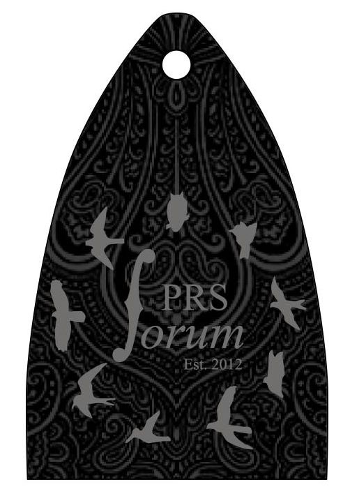
The only thing I'm not keen on with HS's design is the bird. It's not the shape or the species but it seems a little like an afterthought. the paisley pattern in the background and the moon looks amazing but the bird seems like it's stuck on. I'd love to see a mock up of how it would look with the bird as an outline and the paisley pattern of the background and moon visible within the bird. I can't help but think this would help the whole design blend better.
Regardless, a +1 to the hard work HS has done!
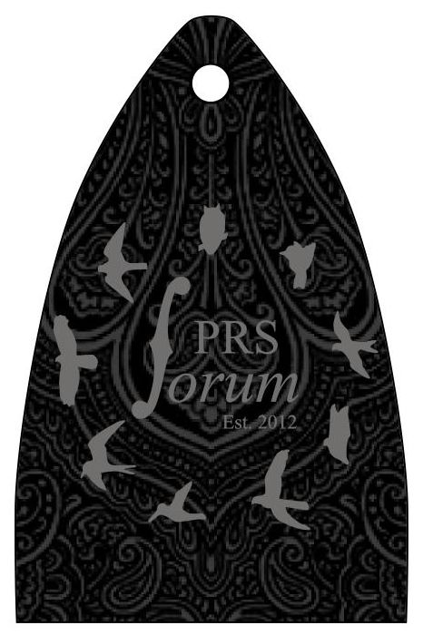

")