NHD! Also a question...

MichaelC24

Sucker for Squabbins
Joined
Apr 28, 2015
Messages
206
Location
Boston, MA
That's right my friends, this is a new headstock day!
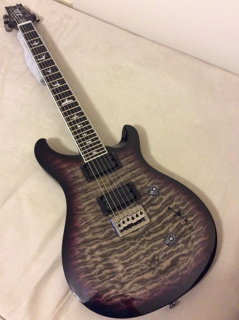
Let me just preface this by saying after having the new SE Holcomb for a month or so, it has become my #1....Now I can't say (at the moment) that I have any Private stock, artist or wood library guitars, but I have some really nice core electrics. Custom 24, 25th SAS, Studio...But this Holcomb is right up there with my US guitars.

Here's where I get a little nit picky....
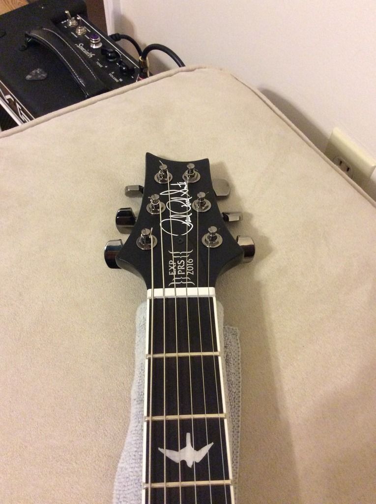
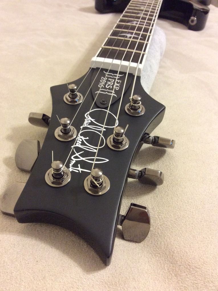
I also have/had quite a few SE models, and love them all. For the price point, I believe there is no better option on the market. The build quality, playability, and athstetics are about as good as it gets for that kind of coin. My big "gripe" is the headstock decals.... I understand there needs to be some level of differentiation between American & Korean made guitars, but maybe something with more PRS branding would make the guitars look nicer. Again, this is just my opinion but I'd love to see a PRS logo of some sort. It doesn't have to be like the US signature, but even the logo on this forum would be an upgrade.

Now even though it's not an expensive, rare or collectors type guitar, I will keep this SE Holcomb for the rest of my life. So I decided to do a little modification to the headstock. I used a matte vinyl overlay with a PRS logo also cut out of vinyl. I left out the trademark R, again I want to reiterate I am taking this guitar to the grave with me and would never use the PRS logo for my own personal gain other than athstetically for my own guitars.

Lastly, I'd really love to put on the faux bone tuners as I think it would compliment the white binding & logo. Does anyone know if the phase 2 or 3 DGT buttons would fit onto the SE tuners?
image_zpspzpsflmp.jpeg

image_zpszr9o69em.jpeg

image_zpsyaicle7n.jpeg
 
I agree that the big SE is ugly and I don't think non PRS players will know what it means. It would be nice to have a better logo for the SE brand.
 
I really lucked out on the top..I had a pre order from sweetwater, and while waiting for the guitars to be shipped I came across this gem on reverb. I couldn't let this one slip as it was one of the nicest tops I had seen on an SE so I bought it on the spot..
 
Looks great!
I did the same to one of my SEs. Just for my own enjoyment . Not trying to pass it off as something it's not.
 
I agree that the big SE is ugly and I don't think non PRS players will know what it means. It would be nice to have a better logo for the SE brand.
I agree. The SE Bernie I just got has the PRS truss rod cover, but some of the newer SEs don't even have that. If you didn't know about PRS, you wouldn't be able to tell. Seems a bit counter intuitive from a marketing standpoint if people can't recognize your product.\

All complaints aside, congrats!
 
I agree that the big SE is ugly and I don't think non PRS players will know what it means. It would be nice to have a better logo for the SE brand.

I agree. The SE Bernie I just got has the PRS truss rod cover, but some of the newer SEs don't even have that. If you didn't know about PRS, you wouldn't be able to tell. Seems a bit counter intuitive from a marketing standpoint if people can't recognize your product.\

All complaints aside, congrats!

On the contrary, it's quite easy to make out the blocky "SE" on the headstock. A quick Google search of "SE guitar" drops you right in the middle of PRS land. Good luck trying to Google "guitar with squiggly writing on the headstock". I still meet plenty of people (musicians included) who have no idea PRS exists.

The original Santana model didn't have any PRS logo, but they started adding the block logo and now it seems they're getting out of that habit. SE has created quite a strong brand identity, so I don't think it matters any more.

I always say there ain't no shame in playing an SE, but hey, make it your own.
 
I totally agree...my bass player in one of my new bands is in the market for a new bass. He was looking at a few different models/brands and I had sent him a link to the kingfisher. He fell in love with it, but the first thing he said was that headstock totally throws off the rest of the beautiful athstetics of the guitar. He asked why Warwick, fender, and quite a few other brands all have their logos on imports, and PRS does not. Now this is a perspective of a guy that has Never owned anything Prs and doesn't know much of anything about the company. I talked him into the kingfisher eventually, but just because of that logo he was thrown off. Now I would never think twice of buying an SE, but I can see how others not aware of Prs quality could look at something that simple and he turned off. It's kind of sad that we think that way...but some people do and you can't really blame them.
 
Last edited:
On the contrary, it's quite easy to make out the blocky "SE" on the headstock. A quick Google search of "SE guitar" drops you right in the middle of PRS land. Good luck trying to Google "guitar with squiggly writing on the headstock". I still meet plenty of people (musicians included) who have no idea PRS exists.

The original Santana model didn't have any PRS logo, but they started adding the block logo and now it seems they're getting out of that habit. SE has created quite a strong brand identity, so I don't think it matters any more.

I always say there ain't no shame in playing an SE, but hey, make it your own.
I just think the SE logo needs an update. I have no problem with SEs having their own logo, but it needs something better.
 
Cool mod, looks a lot nicer!

I agree, the SE headstocks are pretty lame. I think it was the 30th Anniversary SE's that had the same logo but it was smaller, and in my opinion, much nicer and less tacky.
I think a redesign for SE logos would be great. Throw 'PRS' on there with SE beside it or under it or something. Seems kind of silly to not have 'PRS' on the headstock.

There would be no room for confusion, especially if you just have 'PRS' (not Paul Reed Smith in script or anything).
 
I have mixed feelings about the SE headstocks and whether a change is a good idea.

The logo as it stands is recognizable to those that know, and does differentiate from the Core line. So +1 for "brand differentiation".

But there are a few PRS SE models that do not even have "PRS" on the headstock, which leaves the "face" of the guitar somewhat anonymous. So -1 for supporting parent company brand awareness.

By putting the PRS logo on the TRC of SEs (when they actually do that), PRS is almost asking folks to swap them out for something else and remove the branding. If the "PRS" logo was embedded in the headstock, and the "SE" was on the TRC it wouldn't seem so weird.

Frankly, I think I would like to see "PRS SE" on the headstock itself, and leave the TRC for signature-model names (a la Zach Myers, Mark Holcomb) or "Custom" or "SC" etc for regular editions. That would also allow folks to remove the "signature" from their instrument if they don't feel a particular attachment - i.e. someone who really like the specs of a ZM, but doesn't want or need the association with the name for whatever reason. (Harder to do with the Paul Allender and Mikael Akerfeldt sig models, obviously...)

But what do I know. I don't work in marketing, and I didn't stay at a Holiday Inn Express last night either.
 
What name brand should SE guitars be called? Any ideas on a Epiphone/Squire like name?
Well, Epiphone was a real company that built quality instruments before Gibson bought them. And they still make good instruments, IMHO - I really like my Casino, for example.

Squier was, a long time ago, a maker of strings, not instruments. So Fender kind-of feigned / finessed that one.

To mimic that behavior, PRS would have to acquire another brand and then re-use it for what they currently call "SE". I'm OK with them sticking with SE as a brand.

I guess what you are asking is: should PRS invent a new brand name for the SE line? IMHO, no.
 
Last edited:
Umm, SE is the brand, and a very strong one at that.

It's interesting to look back at the original Santana SE and the Tremonti SE (the first two SE models). They were positioned to make the name of the player the brand, and the SE was this tiny little footnote on the headstock. The "SE" grew in size, rightfully so, as the brand built popularity. It isn't glamorous, but it's effective.
 
Back
Top